Introducing the New SWISSRoute Logo
Cross-border payments never stand still. Networks expand.Regulations evolve. Expectations rise. To keep value moving smoothly acrossborders, SWISSRoute must evolve too.
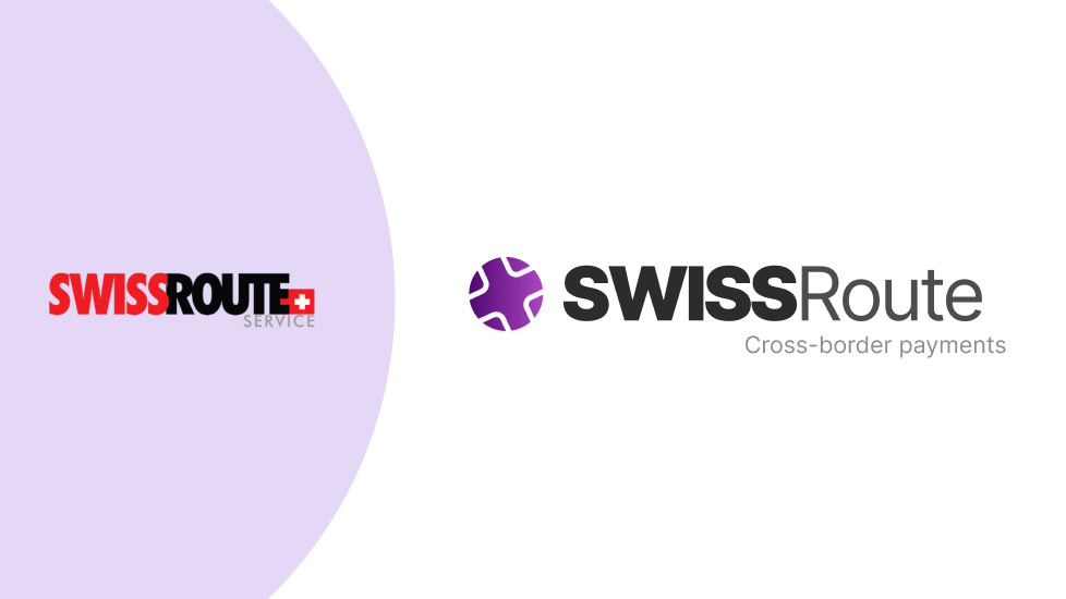
Today, we unveil the new SWISSRoute logo, a refined visualidentity that signals progress, partnership, and precision in global payments.
This evolution is intentional. Because for SWISSRoute,standing still is not an option.
Built for a World in Motion
SWISSRoute was created to solve one of banking’s mostcomplex challenges: enabling secure, compliant, and efficient cross-borderpayments across fragmented systems.
Built by IBIS Management, in partnership with Finastra, SWISSRoute connects institutions to global payment networks—bringing structure,clarity, and reliability to international transactions.
As the platform continues to grow in scale and reach, itwas time for the brand to reflect that maturity.
Not by changing what SWISSRoute stands for, but byexpressing it more clearly.
The Meaning Behind the New Logo
The new SWISSRoute logo is rooted in trust, structure, andconnectivity. Inspired by the Swiss cross, the mark reflects the principlesSwitzerland is known for worldwide:
- Stability
- Neutrality
- Financial integrity
The intersecting lines within the symbol representcross-border routes, the paths payments take as they move between institutions,countries, and currencies.
Together, they visualize SWISSRoute’s core mission:
turning fragmented international payment systems into one seamless flow ofvalue.
A Symbol of Partnership and Integration
One of the most distinctive elements of the new identity isthe purple gradient. This is not a stylistic choice—it’s a statement. Thegradient represents the seamless partnership between IBIS Management andFinastra, merging expertise, infrastructure, and technology into a single,unified payment ecosystem.
It reflects:
- Collaboration over complexity
- Integration over fragmentation
- One connected solution instead of disconnected systems
Just like SWISSRoute itself.
Designed for GlobalFinancial Environments
The new logo was designed to live where SWISSRoute operates—across international, enterprise-grade environments.
It scales effortlessly across:
- Digital platforms and dashboards
- Mobile applications
- SWIFT-related communications
- Events, partner materials, and merchandise
Whether displayed in full color or mono-color, the identityremains consistent, recognizable, and unmistakably SWISSRoute—supporting trustat every touchpoint.
What Hasn’t Changed
While the visual identity has evolved, the foundationremains the same:
- Secure and compliant cross-border payment processing
- Direct connectivity to global networks like SWIFT
- Designed for any institution, anywhere
- Powered by IBIS, in partnership with Finastra
Same mission. Stronger expression.
Looking Forward
This logo reveal marks more than a design update, itsignals the next chapter for SWISSRoute.
As international payments continue to evolve, SWISSRoute will keep doing what it does best: connecting institutions, simplifyingcomplexity, and enabling borderless flow of value.
It was time to evolve.
Welcome to the next evolution of SWISSRoute.

