
A New Look for Alchemy: Same Engine. New Look.
After more than two decades of powering banks and financialinstitutions worldwide, Alchemy has evolved.
Today, we are proud to unveil Alchemy’s new logo, a refinedvisual identity that reflects where the platform is today and where it is going next.
This is not a reinvention.
It’s a clearer expression of who we already are.
See our launch videi
Why We Evolved
Alchemy was named after the ancient art of transformation, theprocess of turning complexity into clarity and inefficiency into value. That principle has guided the platform since day one.
Over the years, Alchemy has grown into a robust,ISO-compliant, enterprise-grade payment processing suite, supporting bankswith:
- Automated back-office operations
- Straight-through processing (STP)
- Regulatory compliance
- Scalable, future-ready payment infrastructures
As the platform matured, our visual identity needed tomature with it.
The new logo represents Alchemy today: confident, precise,calm, and powerful—built for modern banking environments and future paymentecosystems.
The Meaning Behind the New Logo
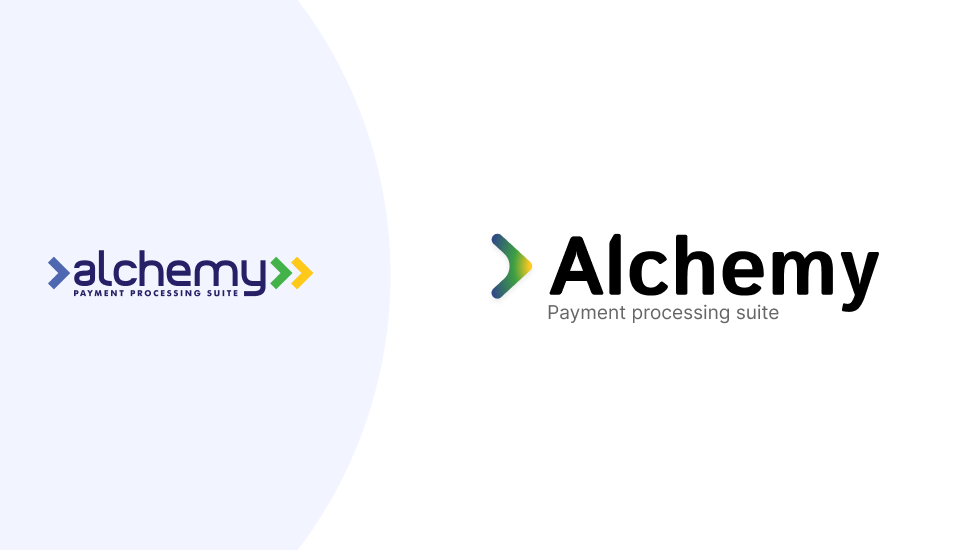
The updated Alchemy logo is designed around movement and direction.
At its core is a forward-moving mark built with subtlearrows, symbolizing progress, automation, and controlled flow, mirroring howAlchemy guides payments seamlessly through complex infrastructures.
The colors tell a deliberate story:
- Blue represents stability, trust, and reliability—the foundation banks depend on
- Green reflects growth, efficiency, and optimization
- Gold symbolizes value creation, insight, and long-term impact
Together, they illustrate Alchemy’s role in movinginstitutions from banking stress to structured simplicity, without sacrificingcontrol or compliance.
Designed for ModernBanking
The new logo was created with today’s digital environmentsin mind.
It scales seamlessly across:
- Enterprise platforms and dashboards
- Mobile applications
- Digital channels and social media
- Merchandising and event branding
Whether displayed in full color, mono-color, or app iconformat, the identity remains clear, consistent, and unmistakablyAlchemy—ensuring strong recognition across every touchpoint.
What Hasn’t Changed
While the look has evolved, the essence of Alchemy remainsthe same.
- The same powerful processing engine
- The same commitment to compliance and security
- The same focus on automation, efficiency, and reliability
- The same partnership mindset with our clients
Same engine. New look.
This evolution simply brings the outside in line with thestrength that has always existed at the core of the platform.
Looking Ahead
This logo reveal marks the start of a new chapter forAlchemy—one focused on clarity, confidence, and continued innovation.
As payment landscapes evolve and regulatory demandsincrease, Alchemy will continue to do what it does best:
turn complexity into calm, and operations into opportunity.
Welcome to the next evolution of Alchemy.